Blog
It’s Time to Put Your Resume to Work: Post 8. How Dressed Up Does Your Resume Need to Be?

So now you are ready to produce your resume. It’s time to put ink to paper or dark digital bits to screen. You’ve followed all of the suggestions in this series. You have amazing, powerful, spot on bullet points. The words you are using align with the language from the job listing. You have responded to every requirement. Now it is time to create the physical (or virtual) resume document.
Good Order
The first consideration when producing the resume document is determining what information to place in what order. First comes your name, address and contact information. Next is a summary. The order of education, experience, professional organizations, publications, etc. has been dissected and debated ad infinitum by others. The best rule is to lead with the information that is most important to the recipient of the resume. In most cases that will be your experience. You may find that some fields of endeavor have their own rules concerning the order of the various sections. There may also be some reasons to change the order based on your experience. If you have 20 years of experience, you may wish to express things in a different order than someone who has just completed an apprentice program or gotten a degree.
Pretty or Plain
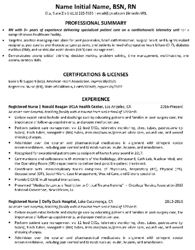
The next consideration seems to be visual but is actually about clarity. Should you follow a “traditional” text-centric format, with the majority of text aligned down the left side of the page. For example:
Alternatively, is this the time to show your clever and creative side by doing something different. Perhaps you are thinking something like this:
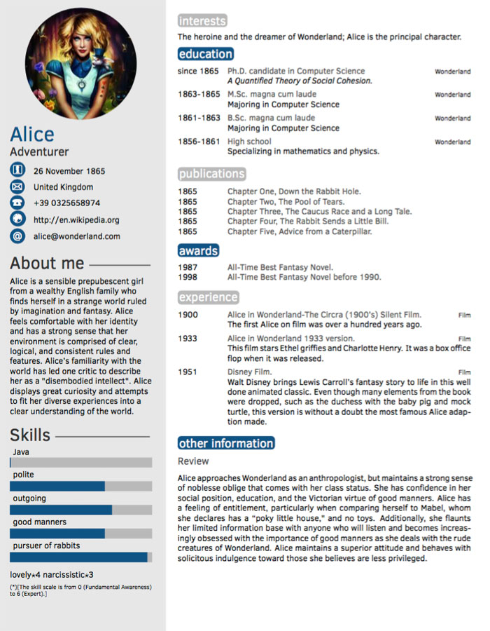
In a world where we are surrounded by graphics, we sort of seem drawn to the resume with the colors, images, multiple fonts, etc. Give that a second thought. There are reasons why most resumes are of the first and not the second type.
First, the standard black letters on light colored piece of paper resume is simple to create. It follows certain conventions that are recognized by the creator and the recipient. It is relatively easy to type, tab, correct, and align.
The negatives on the more colorful one is the lack of being what is listed above as well as the fact that beauty is in the eye of the beholder. What you think is cutting edge and attractive may be nausea inducing for the hiring manager and created using her least favorite colors.
Finally, the best reason to stick to the simpler and more traditional form is that it will be able to be read by the ATS (Applicant Tracking System software) that it is likely to be subjected to. The odds are very high that you will submit a resume online. Some of these systems will only be able to receive and process the simpler formats. Some of them may say they are fine with anything including multimedia. However, please be cautious. You have no idea exactly what is going to come out on the other side. Most systems either want a simple .txt file or a PDF. Do not assume that the use of a PDF means that anything goes or that everything will be received.
If you are dying to be creative, you can submit a portfolio of your work. That is true for the arts, coding, drafting, etc. Another place to include things which show off your creativity is attaching them to your LinkedIn profile or on a personal job search website. Your resume can be ultra-traditional and you can let your freak flag fly with things you direct the hiring manager to, if you believe they will help you get an interview.
If you are in a highly creative field or just can not contain yourself when it comes to creativity, consider creating two versions of your resume. Produce a creative one, at least giving consideration for standard grouping and using all of the other stuff about aligning with language, and bullet point, etc. Then create a good old fashion words on blank sheet version. If you are submitting the resume electronically then use the simpler, plainer, easily searchable version. If you are submitting a physical (on paper) resume in person or via the mail, you could use the more colorful version.
White, ivory, light beige, gray mist
If you are sending a physical resume, what kind of paper should you use? Please do not sweat this one. At one time, off-white would have been the standard. White seems to be preferable now.
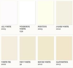
You can see the wide range of bland that you can choose from and see why white wins out. Or maybe not. Remember, the most interesting thing about your resume is supposed to be you.
White or ivory or whatever, use a high quality paper at least one grade nicer than cheap copier paper. Really nice watermarked paper designed for resumes is not a bad idea. Why? Because it shows you made some additional effort to make something nicer.

Watermarked paper has an image in the fiber of the paper, which is visible when the paper is held up to the light. Because there are frequently words, like the name of the paper manufacturer, in the watermark, make sure you print out the resume so that the watermark is readable, right side up and in the same direction as your printed text. Also use the same paper for your cover letter.
Consider using envelopes that are large enough to hold your resume without folding it. In the U.S. that would be a 9 X 12 inch envelope. Why not just fold it and stick it in a standard #10 envelope? Laid out flat, your resume look more professional.
To Serif or not to serif
While we are thinking about details, how about the font you should choose for your resume.
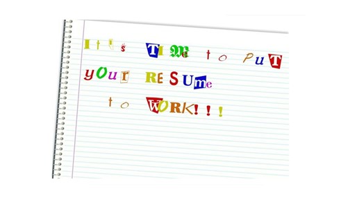
Whatever you do, absolutely, positively use only one font for the entire document. Do not make your resume look like a ransom note.
When selecting a font, choose a common one. Let your exceptional skills and talent be the thing that catches the attention of the hiring manager. Should you use a serif font or a sans serif font? Serif fonts are the ones with the little flat or horizontal lines at the base and top of most letter’s vertical lines. Sans-serif fonts are missing the little lines. Either one is acceptable. It is a matter of personal choice. Consider Times New Roman if you are going with a serif font and consider Verdana or Arial if you want to go with sans-serif. I lean to serif, but it is a personal choice. I am hard pressed to believe that your consideration for a position is likely to be affected one way or the other by whether there are little horizontal lines under each letter or not.
If you physically print out a resume, print it one sided. Also, only print your cover letter on one side of the paper. This lessens the readers distraction. Do not hand address the envelope. Print out the address using a label printer.
The major consideration with the suggestions in this post is to avoid letting superfluous negative things, like the wrong colors, serifs, folds, or handwriting, get between you and the interview. You never know what the hiring manager’s pet peeve might be, especially if he is having a bad day. Don’t let little things get in the way of that terrific resume you have spent so much effort getting right.
___________________________________________________
The suggestions and advice given in the articles about resumes provides a lot of information to help you put your resume to work. Please let me know if you have found it helpful. To make sure others have access to this valuable information, please go back to this article in LinkedIn and like and comment on the actual post where the most people are likely to see it. Thanks for your kindness.
If you need help with your resume, your job search or in putting your Strengths to work, please contact Crews Strengths at https://www.crewsstrengths.com/pages/contact.html .
_____________________________________________________
There is still more to come on resumes and Strengths and the whole job search experience.
If you need to catch up on the earlier posts in the “It’s Time to Put Your Resume to Work” series, here is the way to get to that valuable content:
- Part 1 – Background information about resumes.
- Part 2 – Parts of a resume and what information ought to be in them.
- Part 3 – The a la Carte Resume or customizable resume, a method to quickly create a resume that responds to the “demands” of any job listing.
- Part 3a – BONUS short post about the proper length for a resume
- Part 4 – Discover the potential employer’s language and then use it in your resume.
- Part 5 – Creating a Universal Resume (when you don’t have All the Facts.
- Part 6. Avoiding the Mundane, Boring, and Useless in your resume.
- Part 7. What to Do When You Don’t Meet All the Requirements.
Previous Posts
- “It’s Time for You to Ask the Questions!” - August 8, 2024
- What “Superpowers” are Hiding in Your Toolbox?: - May 29, 2024
- It’s Time to Put Your Strengths to Work for Your Interview – Part 4 - October 16, 2023
- It’s Time to Put Your Strengths to Work for Your Interview – Part 3 - August 21, 2023
- It’s Time to Put Your Strengths to Work for Your Interview – part 2 - July 20, 2023
- It’s Time to Put Your Strengths to Work for Your Interview - June 22, 2023
- It’s Time to Put Your References to Work - February 14, 2023
- It’s Time to Work Around Your Weaknesses - November 15, 2022
- It’s Time to Put Your Skills, Talents, Strengths (and even Weaknesses) to Work! (Once you figure out what they are). - October 13, 2022
- It’s Time to Put Your Strengths to Work: Why Hire a Coach? - August 1, 2022
- It’s Time to Put Your Strengths to Work: Rejection and the Job Search - June 25, 2022
- No One Deserves to HATE Their Job! : Your Solution to the “Great Resignation” - May 23, 2022
- It’s Time to Put Your Strengths to Work: Strengths and the Reentry Career Alliance Academy - March 3, 2022
- It’s Time to Put Your Resume to Work: Part 11. An Inventory of Your Career: Resume as Assessment - February 3, 2022
- Have Yourself a Merry Little Job Search: - November 23, 2021
- It’s Time to Put Your Resume to Work: Part 10. - October 21, 2021
- It’s Time to Put Your Resume to Work: Part 9 – Avoiding the Trash - August 25, 2021
- It’s Time to Put Your Resume to Work: Post 8. How Dressed Up Does Your Resume Need to Be? - July 20, 2021
- “It’s Time to Put Your Resume to Work” : Part 7: What to Do When You Don’t Meet All the Requirements - June 24, 2021
- “It’s Time to Put Your Resume to Work”: Part 6. Avoiding the Mundane, Boring, and Useless - May 26, 2021
- “It’s Time to Put Your Resume to Work”, Part 5 – Creating a Universal Resume (When you Don’t have All the Facts) - May 5, 2021
- “It’s Time to Put Your Resume to Work” – Part 4: Finding the Words (literally) - April 7, 2021
- BONUS – “It’s Time to Put Your Resume to Work”- Part 3a : What is the Correct Length for Your Resume? - March 25, 2021
- “It’s Time to Put Your Resume to Work”- Part 3 : The a la Carte or Customizable Resume - March 16, 2021
- It’s Time to Put Your Resume to Work – part 2 - February 9, 2021
- It’s Time to Put Your Resume to Work – part 1 - January 27, 2021
- Strengths Help You Hear the Music - October 20, 2020
- StrengthsFinder & the Ancient Philosopher - September 3, 2020
- StrengthsFinder Domains: A View of Your Strengths from 50,000 Feet - July 20, 2020
- Talents are Your Edge in a Job Search - June 25, 2020
- This Is Who You Are and That’s A Good Thing - May 22, 2020
- Introvert or Extrovert: A CliftonStrengths view - May 13, 2020
- Is It Time to Put Your “Superpowers” to Work? - April 10, 2020
- Who Are You? - April 3, 2020